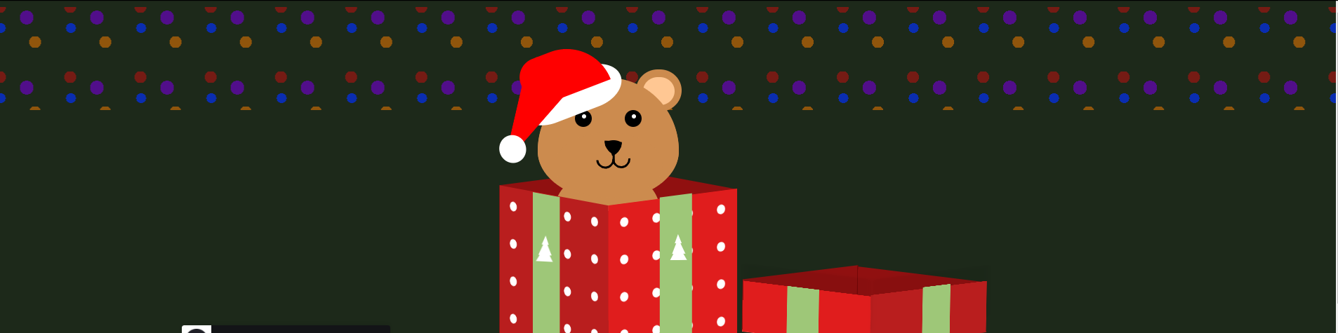
Sur le site codepen.io, vous pourrez découvrir un code HTML/CSS intitulé Festive Christmas Gift proposé par Priyanka Patel. Ce code vous permet de mettre en place un cadeau de Noël duquel apparait un ourson.
Le code HTML :
<body>
  <div class="light-one"></div>
  <div class="light-two"></div>
  <div class="present">
    <div class="ribbon">
      <div class="ribbon-line-left"></div>
      <div class="ribbon-line-right"></div>
      <div class="ribbon-part-left"></div>
      <div class="ribbon-part-right"></div>
      <div class="ribbon-cut-out"></div>
    </div>

    <div class="teddy-santa-hat">
      <div class="teddy-santa-hat-part"></div>
    </div>
    <div class="teddy-bear">
      <div class="bear-left-ear"></div>
      <div class="bear-right-ear"></div>
      <div class="bear-left-eye"></div>
      <div class="bear-right-eye"></div>
      <div class="bear-nose"></div>
      <div class="bear-mouth"></div>
    </div>

    <div class="box-lid">
      <div class="box-top-lid"></div>
      <div class="box-left-lid"></div>
      <div class="box-front-lid"></div>
      <div class="box-right-lid"></div>
      <div class="box-back-lid"></div>
    </div>

    <div class="box">
      <div class="box-left"></div>
      <div class="box-front"></div>
    </div>
    <div class="back-box-cover">
      <div class="box-right"></div>
      <div class="box-back"></div>
    </div>
    <div class="tree-left"></div>
    <div class="tree-right"></div>
  </div>
</body>
Le code CSS :
body {
   background-color: #2d2416;
   align-items: center;
   display: flex;
   margin: 0;
   padding: 0;
   height: 100%;
   animation: background-change 7s ease-in-out alternate infinite;
 }

 @keyframes background-change {
   0% {
     background-color: #2d2416;
   }
   50% {
     background-color: #192d16;
   }
   100% {
     background-color: #2d1629;
   }
 }

 .light-one,
 .light-two {
   height: 31%;
   position: absolute;
   top: 9px;
   width: 100%;
   background-image: radial-gradient(circle, #f17900 12%, transparent 0%), radial-gradient(circle, #be0e0e 12%, transparent 1%);
   background-size: 100px 100px;
   background-position: 0 0, 50px 50px;
   animation: blinking 2s linear infinite;
 }

 .light-two {
   background-image: radial-gradient(circle, #002fff 10%, transparent 0%), radial-gradient(circle, #6c00c5 14%, transparent 0%);
   background-size: 100px 100px;
   background-position: -49px -20px, 88px -35px;
   animation: blinking 2s linear 1s infinite;
 }

 @keyframes blinking {
   50% {
     opacity: 0.2;
     background-size: 100.1px 100px;
   }
 }

 .present {
   position: absolute;
   left: 40%;
   bottom: 35%;
   animation: moving-present 1s ease-in-out 1s 3;
 }

 @keyframes moving-present {
   0% {
     transform: scaley(1);
   }
   20% {
     transform: translateY(90px);
   }
   40% {
     transform: scalex(1.05);
   }
   100% {
     transform: scaley(1.1);
   }
 }

 .ribbon {
   width: 40px;
   height: 40px;
   background: red;
   border-radius: 100px / 50px;
   position: absolute;
   box-shadow: -10px 0px 13px -7px #000000, 10px 0px 13px -7px #000000, 5px 5px 15px 5px rgba(0, 0, 0, 0);
   transform: rotate(-6deg);
   top: -152px;
   left: 91px;
   z-index: 2;
   transform-style: preserve-3d;
   animation:  moving-ribbon 2.4s ease-in 3s both;
 }

 @keyframes moving-ribbon {
   35% {
      top: -316px;
      left: 136px;
      transform: rotateX(0deg) rotateY(0deg) rotateZ(23deg);
    }

   88% {
     top: -189px;
     left: 259px;
     transform: rotateX(63deg) rotateY(67deg) rotateZ(4deg);

   }
   100% {
     visibility: hidden;
     top: -152px;
     left: 291px;
     transform: rotateX(63deg) rotateY(72deg) rotateZ(20deg);
   }
 }

 .ribbon::after {
   content: "";
   position: absolute;
   width: 20px;
   height: 64px;
   top: 8px;
   left: -11px;
   background: red;
   transform: rotate(43deg);
 }

 .ribbon::before {
   content: "";
   position: absolute;
   width: 21px;
   height: 73px;
   top: 5px;
   left: 17px;
   background: red;
   transform: rotate(-27deg);
 }

 .ribbon-part-left {
   width: 0;
   height: 0;
   position: absolute;
   border-top: 45px solid transparent;
   border-right: 87px solid red;
   border-bottom: 14px solid transparent;
   border-radius: 9px;
   right: 16px;
   bottom: -7px;
   transform: rotate(216deg);
 }

 .ribbon-part-left::before {
   content: '';
   position: absolute;
   width: 50px;
   height: 148px;
   background: radial-gradient(ellipse at 49% 71%, #de2121 19%, transparent 2%);
   transform: rotate(-119deg);
   top: -88px;
   right: -56px;
 }

 .ribbon-part-left::after {
   content: '';
   position: absolute;
   width: 41px;
   height: 177px;
   transform: rotate(97deg);
   background: radial-gradient(ellipse at 76% 75%, #ff0000 13%, transparent 1%);
   left: 83px;
   top: -86px;
 }

 .ribbon-part-right {
   width: 0;
   height: 0;
   position: absolute;
   border-top: 45px solid transparent;
   border-right: 87px solid red;
   border-bottom: 14px solid transparent;
   border-radius: 9px;
   transform: rotate(-20deg);
   top: -20px;
   right: -51px;
 }

 .ribbon-part-right::before {
   content: '';
   position: absolute;
   width: 56px;
   height: 148px;
   background: radial-gradient(ellipse at 49% 71%, #de2121 19%, transparent 2%);
   transform: rotate(-83deg);
   top: -72px;
   right: -55px;
 }

 .ribbon-part-right::after {
   content: '';
   position: absolute;
   width: 56px;
   height: 146px;
   background: radial-gradient(ellipse at 49% 71%, #ff0000 19%, transparent 2%);
   transform: rotate(-111deg);
   top: -93px;
   right: -60px;
 }

 .ribbon-line-left {
   position: absolute;
   margin-top: 8px;
   width: 19px;
   height: 1px;
   left: -22px;
   z-index: 1;
   transform: rotate(22deg);
   background-color: #ca0c0c;
 }

 .ribbon-line-left::before {
   content: '';
   position: absolute;
   top: -9px;
   left: 0;
   width: 20px;
   height: 1px;
   transform: rotate(20deg);
   background-color: #ca0c0c;
 }

 .ribbon-line-left::after {
   content: '';
   position: absolute;
   top: 7px;
   left: 0;
   width: 19px;
   height: 1px;
   transform: rotate(167deg);
   background-color: #ca0c0c;
 }

 .ribbon-line-right {
   position: absolute;
   margin-top: 8px;
   width: 19px;
   height: 1px;
   left: 41px;
   z-index: 1;
   transform: rotate(152deg);
   background-color: #ca0c0c;
 }

 .ribbon-line-right::before {
   content: '';
   position: absolute;
   top: -9px;
   left: 0;
   width: 20px;
   height: 1px;
   transform: rotate(20deg);
   background-color: #ca0c0c;
 }

 .ribbon-line-right::after {
   content: '';
   position: absolute;
   top: 7px;
   left: 0;
   width: 19px;
   height: 1px;
   transform: rotate(167deg);
   background-color: #ca0c0c;
 }

 .ribbon-cut-out {
   position: absolute;
   width: 0;
   height: 0;
   top: 54px;
   left: -29px;
   border-left: 10px solid transparent;
   border-right: 10px solid transparent;
   border-bottom: 12px solid #b91e1e;
   transform: rotate(41deg);
   z-index: 1;
 }

 .ribbon-cut-out::before {
   content: '';
   position: absolute;
   width: 0;
   height: 0;
   top: -34px;
   left: 43px;
   border-left: 10px solid transparent;
   border-right: 10px solid transparent;
   border-bottom: 12px solid #e01d1d;
   transform: rotate(-60deg);
   z-index: 1;
 }

 .ribbon-cut-out::after {
   content: '';
   width: 43px;
   height: 33px;
   border-radius: 99px / 84px;
   position: absolute;
   top: -69px;
   left: -21px;
   z-index: 1;
   transform: rotate(-33deg);
   border: 1px solid;
   color: #ab1313;
 }

 .box,
 .box-lid,
 .back-box-cover {
   height: 240px;
   top: 50px;
   position: absolute;
   transform-style: preserve-3d;
   transform: rotateX(261deg) rotateY(0deg) rotateZ(-140deg);
   width: 240px;
   bottom: 100px;
 }

 .back-box-cover {
   z-index: -1;
 }

 .box-lid {
   top: -160px;
   left: 0px;
   z-index: 1;
   animation: moving-lid 4s ease-in 3s forwards;
 }

 @keyframes moving-lid {
   20% {
     top: -336px;
     left: 0px;
     transform: rotateX(262deg) rotateY(-21deg) rotateZ(-138deg);
   }
   100% {
     top: -29px;
     left: 352px;
     transform: rotateX(263deg) rotateY(-181deg) rotateZ(-139deg);
   }
 }

 .box-top-lid {
   height: 105%;
   left: 0px;
   position: absolute;
   top: -6px;
   width: 101%;
   background: #b91e1e;
   transform: translateZ(-72px);
 }

 .box-top-lid::before {
   position: absolute;
   content: '';
   height: 26%;
   left: -3px;
   top: 83px;
   width: 101%;
   background: #8eb767;
 }

 .box-top-lid::after {
   position: absolute;
   content: '';
   height: 25%;
   left: -14px;
   top: 91px;
   width: 107%;
   transform: rotate(92deg);
   background: #8eb767;
 }

 .box-front,
 .box-front-lid {
   height: 100%;
   left: 0;
   position: absolute;
   top: 0;
   width: 100%;
   background: #e01d1d;
   transform: rotateX(90deg) scaleY(0.9);
   transform-origin: bottom;
   background-image: radial-gradient(#ffffff 17%, transparent 19%);
   background-size: 60px 60px;
 }

 .box-front-lid {
   transform: rotateX(90deg) scaleY(0.3);
   box-shadow: 0px 82px 12px #0000000f;
   width: 101%;
   height: 101%;
   top: 4px;
   border-top: solid 2px #ff4a4a;
   background: #e01d1d;
 }

 .box-back,
 .box-back-lid {
   height: 100%;
   left: 0;
   position: absolute;
   top: -241px;
   width: 100%;
   background: #901010;
   transform: rotateX(90deg) scaleY(0.9);
   transform-origin: bottom;
 }

 .box-back-lid {
   transform: rotateX(90deg) scaleY(0.3);
 }

 .box-front::after,
 .box-front-lid::after {
   content: '';
   height: 101%;
   position: absolute;
   top: -2px;
   left: 84px;
   background: #9ec778;
   width: 60px;
 }

 .box-left,
 .box-left-lid {
   height: 100%;
   left: 0;
   position: absolute;
   top: 0;
   background: #b91e1e;
   transform: translateZ(-216px) rotateY(90deg) scaleX(0.9);
   transform-origin: right;
   width: 240px;
   background-image: radial-gradient(#ffffff 17%, transparent 19%);
   background-size: 60px 60px;
 }

 .box-left-lid {
   transform: translateZ(-72px) rotateY(90deg) scaleX(0.3);
   width: 246px;
   height: 105%;
   top: -3px;
   left: -4px;
   box-shadow: -74px -5px 12px #0000000f;
   background: #b91e1e;
 }

 .box-left::after,
 .box-left-lid::after {
   content: '';
   height: 100%;
   position: absolute;
   top: -17px;
   left: 89px;
   background: #9ec778;
   width: 60px;
   transform: rotate(90deg);
 }

 .box-right,
 .box-right-lid {
   height: 100%;
   left: -236px;
   position: absolute;
   top: 0;
   background: #901010;
   transform: translateZ(-216px) rotateY(90deg) scaleX(0.9);
   transform-origin: right;
   width: 240px;
 }

 .box-right-lid {
   transform: translateZ(-70px) rotateY(90deg) scaleX(0.3);
   top: -1px;
   left: -239px;
   height: 249px;
   border-top: solid 2px #750707;
 }

 .teddy-bear {
   background: #cc8b4e;
   position: absolute;
   top: -104px;
   left: 5px;
   height: 173px;
   width: 201px;
   border-radius: 50% 50% 50% 50% / 60% 60% 40% 40%;
   animation: moving-teddy-bear 2s ease-in-out 3s forwards;
   z-index: 0;
 }

 @keyframes moving-teddy-bear {
   100% {
     top: -198px;
   }
 }

 .teddy-bear::before {
   content: '';
   background: #cc8b4e;
   position: absolute;
   top: 77px;
   left: 24px;
   height: 93px;
   width: 154px;
   border-radius: 50% / 50%;
 }

 .teddy-bear::after {
   content: '';
   background: #cc8b4e;
   position: absolute;
   top: 139px;
   left: 24px;
   height: 50px;
   width: 150px;
   border-radius: 90px 90px 0 0;
   z-index: -1;
 }

 .bear-left-ear,
 .bear-right-ear {
   position: absolute;
   width: 65px;
   height: 60px;
   top: -13px;
   left: -6px;
   background: #cc8b4e;
   z-index: -1;
   border-radius: 50px / 47px;
 }

 .bear-left-ear::before,
 .bear-right-ear::before {
   content: '';
   position: absolute;
   width: 45px;
   height: 40px;
   top: 11px;
   left: 10px;
   background: #ffc793;
   z-index: -1;
   border-radius: 50px / 47px;
 }

  .bear-right-ear::after {
   content: '';
   background: #cc8b4e;
   position: absolute;
   top: 12px;
   left: -140px;
   height: 173px;
   width: 201px;
   border-radius: 50% 50% 50% 50% / 60% 60% 40% 40%;
 }

 .bear-right-ear {
   left: 140px;
 }

 .bear-left-eye {
   position: absolute;
   left: 53px;
   top: 45px;
   width: 20px;
   height: 20px;
   background-color: black;
   border-radius: 50%;
   border: solid 2px #000000;
 }

 .bear-left-eye::after {
   content: '';
   position: absolute;
   right: 6px;
   top: 4px;
   width: 4px;
   height: 4px;
   border-radius: 50%;
   background-color: #ffffff;
   border: solid 1px #ffffff;
   animation: moving-teddy-eyes 2s ease 4.8s alternate;
 }

 .bear-right-eye {
   position: absolute;
   left: 124px;
   top: 45px;
   width: 20px;
   height: 20px;
   background-color: black;
   border-radius: 50%;
   border: solid 2px #000000;
 }

 .bear-right-eye::after {
   content: '';
   position: absolute;
   right: 6px;
   top: 4px;
   width: 4px;
   height: 4px;
   border-radius: 50%;
   background-color: #ffffff;
   border: solid 1px #ffffff;
   animation: moving-teddy-eyes 2s ease-in-out 4.8s alternate;
 }

 @keyframes moving-teddy-eyes {
   100% {
     width: 4.5px;
     height: 4.5px;
   }
 }

 .bear-nose,
 .bear-nose:before,
 .bear-nose:after {
   position: absolute;
   width: 0;
   height: 0;
   right: 78px;
   top: 88px;
   border-left: 15px solid transparent;
   border-right: 15px solid transparent;
   border-top: 20px solid black;
   border-radius: 50%;
 }

 .bear-nose:before {
   content: '';
   right: -15px;
   top: -21px;
   transform: rotate(125deg);
 }

 .bear-nose:after {
   content: '';
   right: -14px;
   top: -22.5px;
   transform: rotate(-125deg);
 }

 .bear-mouth {
   position: absolute;
   top: 102px;
   left: 106px;
   width: 20px;
   height: 20px;
   border: 3px solid black;
   border-radius: 92px;
   border-bottom-color: transparent;
   border-left-color: transparent;
   transform: rotate(130deg);
 }

 .bear-mouth::before {
   content: '';
   position: absolute;
   top: 14px;
   left: 12px;
   width: 20px;
   height: 20px;
   border: 3px solid black;
   border-radius: 92px;
   border-bottom-color: transparent;
   border-left-color: transparent;
   animation: moving-teddy-mouth 2s ease-in-out 5s alternate;
 }

 @keyframes moving-teddy-mouth {
   100% {
     height: 21px;
   }
 }

 .bear-mouth::after {
   content: '';
   position: absolute;
   top: 12px;
   left: 11px;
   width: 3px;
   height: 20px;
   transform: rotate(50deg);
   background-color: black;
 }

 .tree-left,
 .tree-right {
   position: absolute;
   width: 0;
   height: 0;
   left: 11px;
   top: 26px;
   border-left: 5px solid transparent;
   border-right: 5px solid transparent;
   border-bottom: 13px solid #ffffff;
   transform: rotate(3deg);
 }

 .tree-right {
   left: 200px;
   top: 24px;
   transform: rotate(-1deg);
 }

 .tree-left::before,
 .tree-right::before {
   content: '';
   position: absolute;
   width: 0;
   height: 0;
   left: -9px;
   top: 6px;
   border-left: 9px solid transparent;
   border-right: 10px solid transparent;
   border-bottom: 22px solid #ffffff;
 }

 .tree-left::after,
 .tree-right::after {
   content: '';
   position: absolute;
   width: 0;
   height: 0;
   left: -12px;
   top: 15px;
   border-left: 12px solid transparent;
   border-right: 12px solid transparent;
   border-bottom: 22px solid #ffffff;
 }

 .teddy-santa-hat {
   position: absolute;
   top: -97px;
   left: -25px;
   width: 153px;
   height: 60px;
   background: white;
   border-radius: 118px / 80px;
   transform: rotate(-21deg);
   z-index: -1;
   animation: moving-teddy-hat 2s ease-in-out 3s forwards;
 }

 @keyframes moving-teddy-hat {
   21% {
     z-index: 1;
   }
   100% {
     z-index: 1;
     top: -205px;
   }
 }

 .teddy-santa-hat::before {
   content: '';
   background: #ff0000;
   position: absolute;
   top: -37px;
   left: 16px;
   height: 67px;
   width: 122px;
   border-radius: 112px 260px 0 0;
   z-index: -1;
 }

 .teddy-santa-hat::after {
   content: '';
   position: absolute;
   top: 5px;
   left: -58px;
   width: 0;
   height: 0;
   border-left: 125px solid transparent;
   border-right: 44px solid transparent;
   border-top: 67px solid #ff0000;
   border-radius: 74px;
   z-index: -2;
   transform: rotate(-56deg);
 }

 .teddy-santa-hat-part {
   position: absolute;
   top: 53px;
   left: -47px;
   width: 38px;
   height: 40px;
   background: white;
   border-radius: 50%;
 }
Source : https://codepen.io/Priyanka_Patel/pen/wvzJxGw
* * Cette case à cocher est obligatoire
*J'accepte